
First impressions matter, and a well‑crafted brochure can be the handshake that turns curiosity into loyalty. Whether you’re promoting a new product, showcasing services, or sharing event details, mastering brochure design empowers you to communicate value quickly and memorably.
Understanding Your Audience
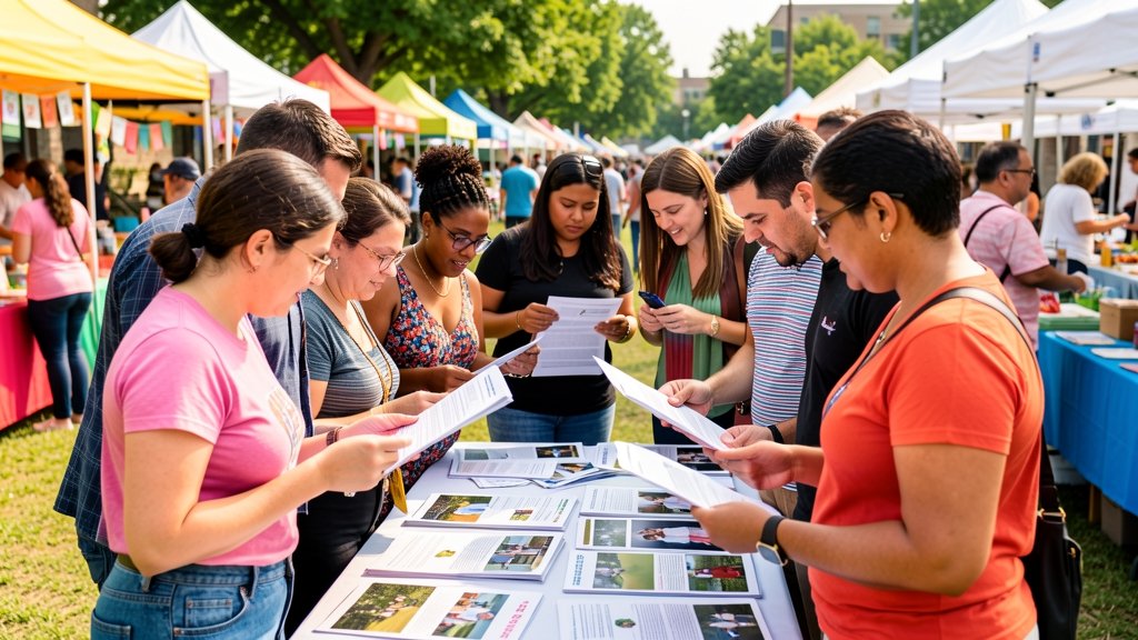
Before any visual decision, pinpoint who will read your brochure. Demographics, interests, and pain points shape the tone, imagery, and language you choose. A brochure for corporate investors will differ dramatically from one aimed at busy parents.
Gather insights through surveys, client interviews, or social listening. The clearer the audience profile, the more targeted and persuasive your content becomes, reducing wasted space and increasing conversion potential.
Choosing the Right Format
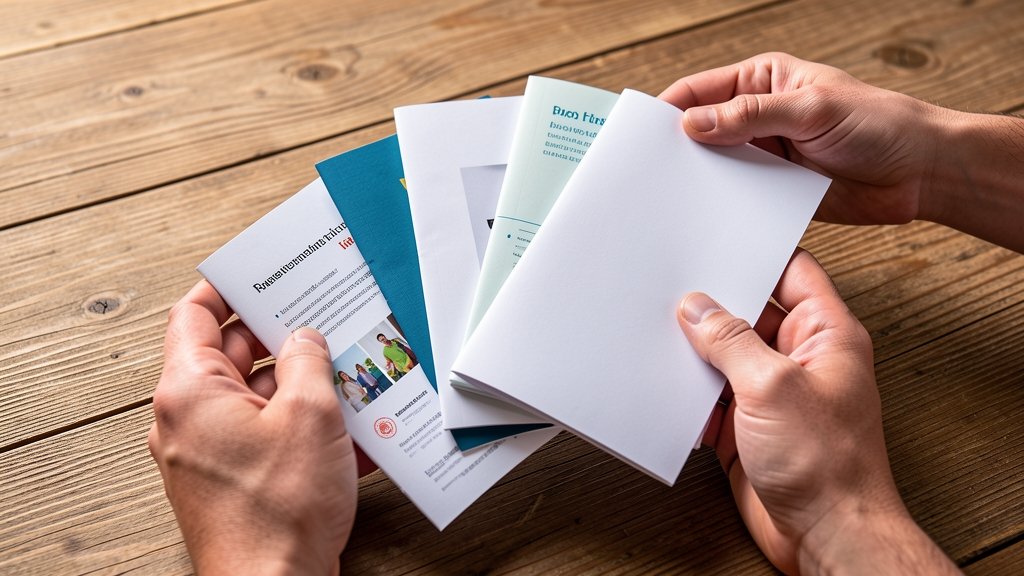
The physical format sets expectations. Trifold, bifold, booklet, or gatefold each offers distinct storytelling pathways. Trifolds guide readers through a linear journey, while booklets allow deeper exploration across multiple pages.
Consider distribution channels—mail‑outs favor compact formats, trade shows benefit from larger, eye‑catching sizes. Align format with budget and handling logistics to ensure your brochure arrives in pristine condition.
Crafting Compelling Headlines
Your headline is the gateway; it must grab attention within seconds. Use action verbs, numbers, or bold promises that resonate with the reader’s needs. For example, “5 Ways to Double Your Event Attendance” sparks curiosity.
Keep it concise—ideally under 10 words—and ensure it reflects the core benefit. Pair the headline with a sub‑headline that adds context, reinforcing the promise without overwhelming the layout.
Designing with Effective Layouts
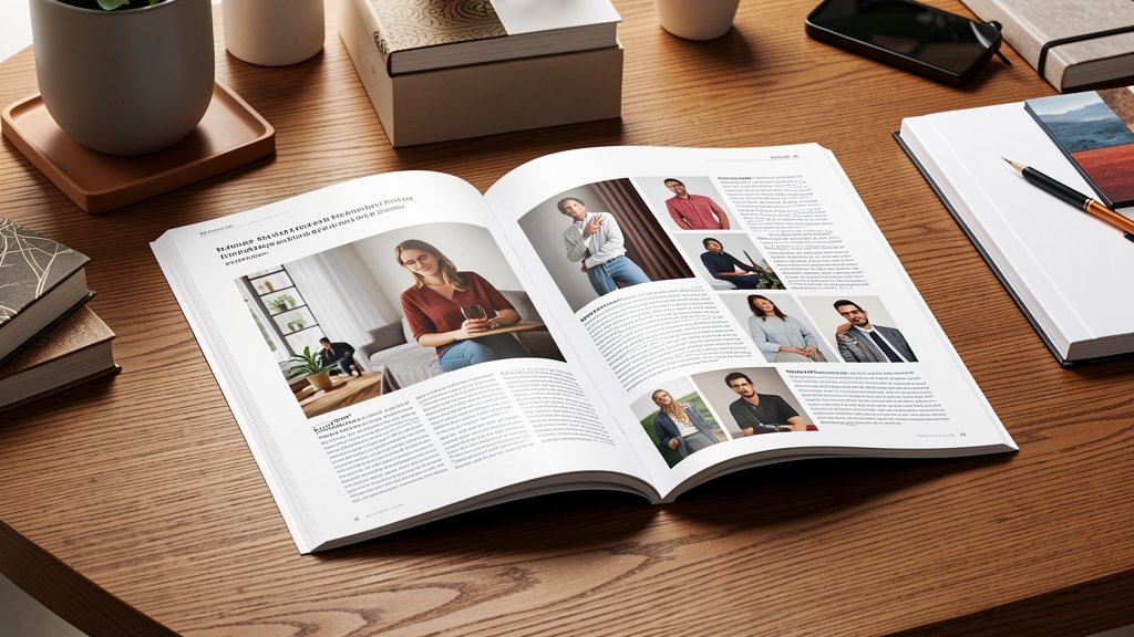
A clean, balanced layout guides the eye naturally from headline to call‑to‑action. Use a grid system to maintain alignment and create visual hierarchy. White space isn’t empty; it provides breathing room and emphasizes key elements.
Place the most important information—benefits, offers, contact details—in the “Z” pattern or golden ratio zones, where readers instinctively focus first. Consistency across panels reinforces brand professionalism.
Selecting Fonts and Colors
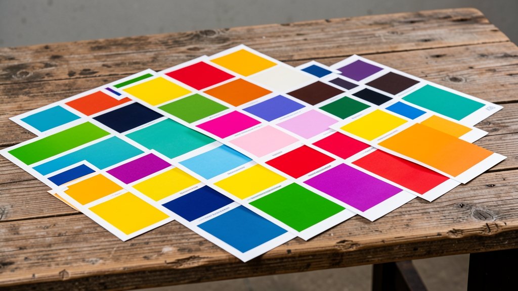
Typography conveys personality. Pair a strong, readable headline font with a complementary body typeface. Limit to two or three typefaces to avoid visual clutter.
Color choices should echo brand guidelines while evoking the desired emotion. Warm hues suggest energy and urgency, whereas cool tones convey trust and calm. Test contrast ratios to guarantee legibility, especially for printed output.
Incorporating High‑Quality Images
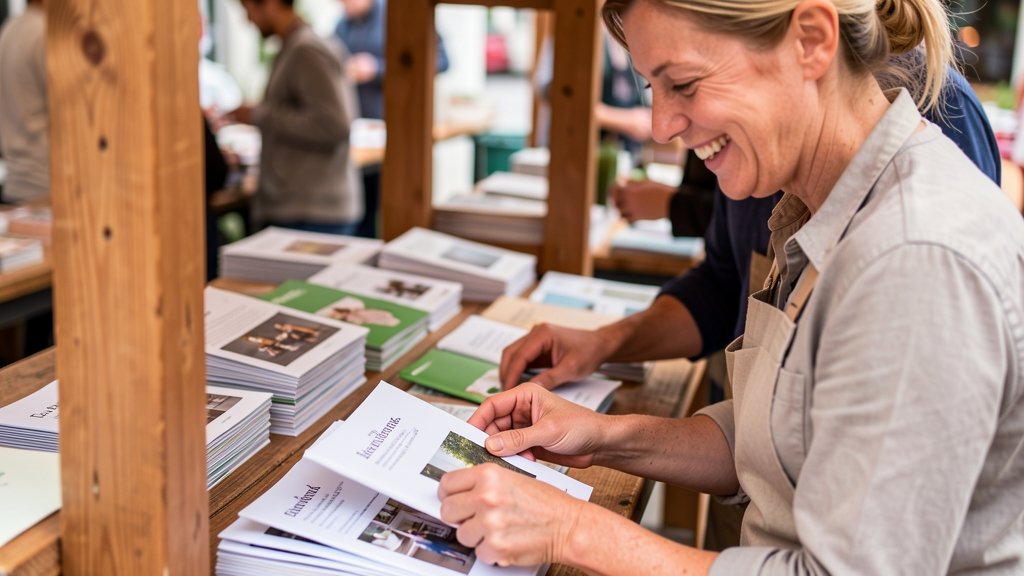
Images anchor your message and break up text. Use high‑resolution photos (300 dpi minimum) that showcase real people, products, or settings relevant to your offer. Authentic visuals build credibility and emotional connection.
Position images strategically—near related copy or as background accents—to reinforce storytelling. Avoid over‑saturation; let the image complement, not dominate, the layout.
Writing Persuasive Copy
Copy should be concise, benefit‑focused, and written in the reader’s voice. Highlight how the brochure’s content solves a problem or fulfills a desire. Use bullet points for scannable lists and include social proof where possible.
End each section with a clear, actionable prompt—whether it’s “Call now,” “Visit our website,” or “Reserve your spot.” Consistent calls‑to‑action drive the reader toward the next step.
Preparing for Print and Distribution
Before sending files to the printer, double‑check bleed settings, color modes (CMYK), and font embedding. Export a print‑ready PDF with high resolution to avoid pixelation.
Choose paper stock that matches the brochure’s purpose—glossy for vibrant visuals, matte for a sophisticated feel. Plan distribution tactics: direct mail, event handouts, or partner placements, and track response rates to measure ROI.
Creating a professional brochure blends strategy, design, and meticulous execution. By following these steps, you’ll produce a polished piece that captures attention, conveys value, and drives results. Ready to bring your vision to life? Try DesignStager’s AI‑powered templates and watch your ideas transform into stunning, print‑ready brochures in minutes.